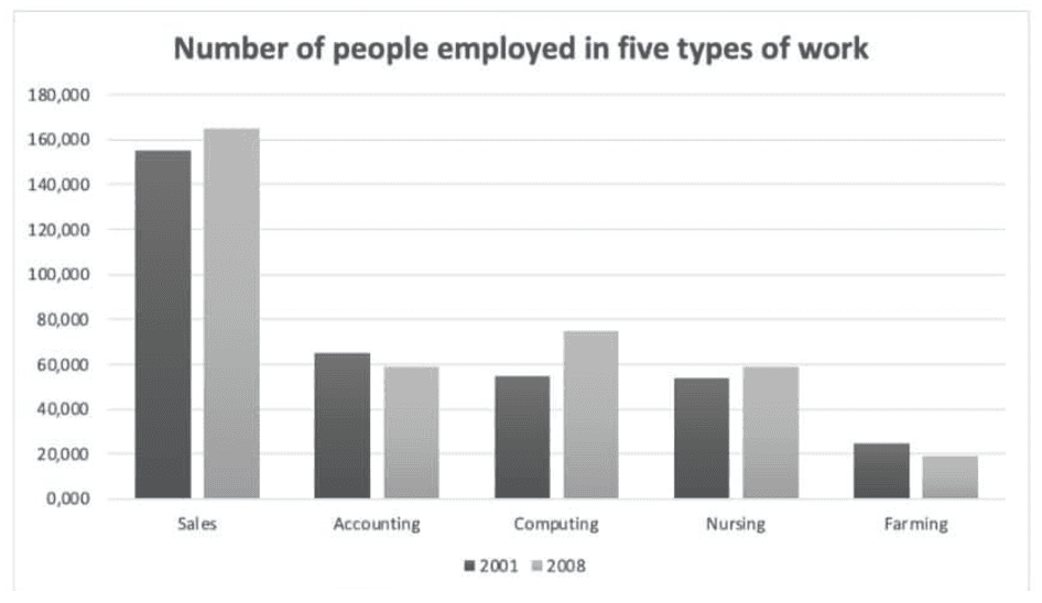
The chart below shows the number of people employed in five types of work in one region of Australia in 2001 and 2008.
Bài này là bar chart nhưng có yếu tố thời gian -> chúng ta sẽ xử lý bài với tư duy line graph
Xu hướng (3 tăng >< 2 giảm)
Đối tượng có con số cao nhất: Sales
sales: cao nhất >< cao gấp 8 lần farming
Accounting, computing và nursing gần bằng nhau (xấp xỉ 60000)
Accounting giảm -> 2. Farming cũng bắt chước, giảm
Đối lập: sales tăng -> computing và nursing cũng tương tự, tăng
Bài mẫu:
The bar chart shows the number of people working in five different occupations - Sales, Accounting, Computing, Nursing, and Farming - in 2001 and 2008.
Overall, the data indicates that the areas of sales, computing, and nursing saw an increase in the number of employees, while accounting and farming experienced a decline during the surveyed years. The majority of people worked in the field of sales.
In 2001, sales had the largest number of workers, at just under 160,000 employees, which was almost 8 times higher than the figure for farming. Additionally, the numbers for accounting, computing, and nursing were relatively equal, with approximately 60,000 employees working in those fields.
By 2008, there had been a gradual decrease of around 1,000 workers in the number of employees in accounting. Farming followed a similar pattern, declining to just below 20,000 people in the same period. In contrast, the figure for sales witnessed a rise of about 2,000 employees. Similarly, nursing and computing also experienced an increase to 60,000 and just under 80,000 people, respectively, in 2008.
(175 words)
Vocabulary:
occupations: nghề nghiệp
indicates: chỉ ra
employees: nhân viên
experienced: trải qua
decline: giảm
surveyed years: các năm khảo sát
majority: đa số
relatively equal: tương đối bằng nhau
gradual decrease: giảm dần
pattern: xu hướng
witnessed: chứng kiến